NY State of Health: Support & Resources
NY State of Health: Support & Resources Redesign
Site prior to redesign
During the Summer of 2021 the State approached my team at GDIT with a challenge: The existing NY State of Health “Info Site”, long used as a repository of help topics and useful resources, was perceived as coming up short on serving its users. The site design hadn’t been touched in around 8 years and was in dire need of something new. The question was what something? State IT resources had started brainstorming around what to do, and had some good ideas, but a cohesive strategy was needed.
The catch: the go-live would be just a few months away, coinciding with planned upgrades to their back-end.
Discovery
We began digging in by getting a better understanding of relevant personas. This was accomplished through conversations with representative stakeholders (no formal user research was budgeted), and analyzing search and site metrics. There were at least five key personas that were key in driving our design process.
We quickly noticed some usability issues:
Discoverability
Very little content was being surfaced. Additionally, there multiple completely different user types being served by the site — all with varying needs —but no clear indication as to which content was meant for whom. Finally, the information for how to get actual live help was buried.Identity
Although the brand was prominent, the home page was dominated by vague imagery and lack of contextual cues, making the purpose of the site unclear. In fact, it was discovered from search metrics that it was often being mistaken as the primary web property. This was a sub-domain of the primary property meant for providing help topics and useful resources, but it was seeming likely that was lost on many users.Navigation
From looking at site analytics — specifically site search, organic search behavior, and page popularity — there was a clear trend suggesting that users were coming here looking for the wrong things; things that were readily available on the primary web property. We had two issues here: SEO performance and contextual cues as to where in the hierarchical space that was NY State of Health that you currently stood.Search
The search feature was fairly hidden, search functionality was not performing well, and the existing content architecture was leading to unpredictable search results. Half of this problem would later be solved by the technical upgrades being made to the underlying CMS.Friction
Looking at search metrics, it was fairly clear what topics were important to the users, and they generally boiled down to a few key categories such as how to enroll, or how to submit documents. Knowing this, there was a clear opportunity to reduce friction by eliminating levels of navigation needed to get these answers.
Content Strategy
Knowing the above we developed a content strategy around 4 key areas:
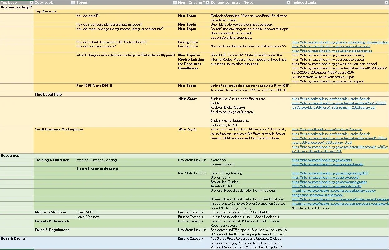
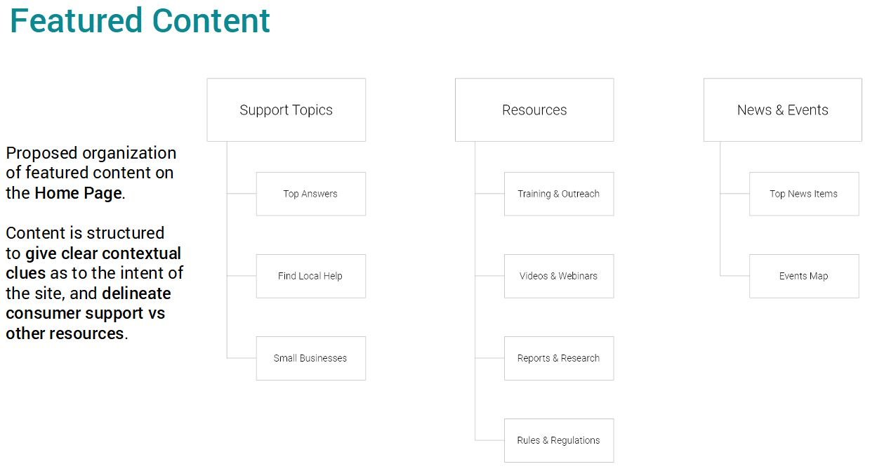
Home Page Content Mapping designed to surface key help topics and resources and visually segmented by key and distinct user types.
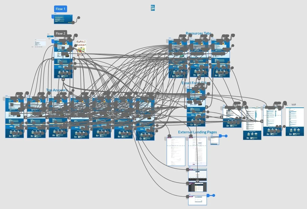
Diagramming the content and identifying key categories.
Increase Discoverability
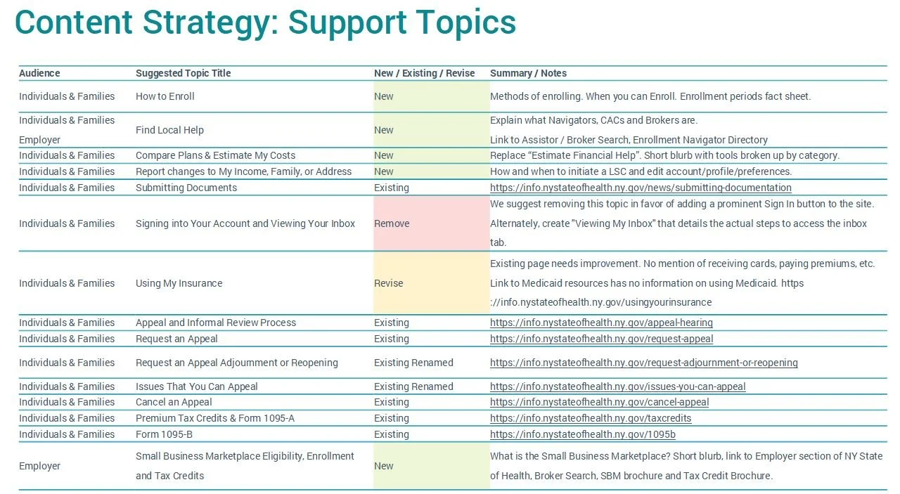
Identify Help Topics
Expand Help Topics
Clean up outdated/inappropriate content (SEO)
The findings were packaged up along with a set of detailed content restructuring guidelines which were presented to the client, who gave their enthusiastic buy-in.
Design
From a site design perspective we identified 3 key areas to to work on:
New, removed, and revised help topics, targeting improvements in SEO and better matching user expectations based on search metrics.
Sustainable identity and design language
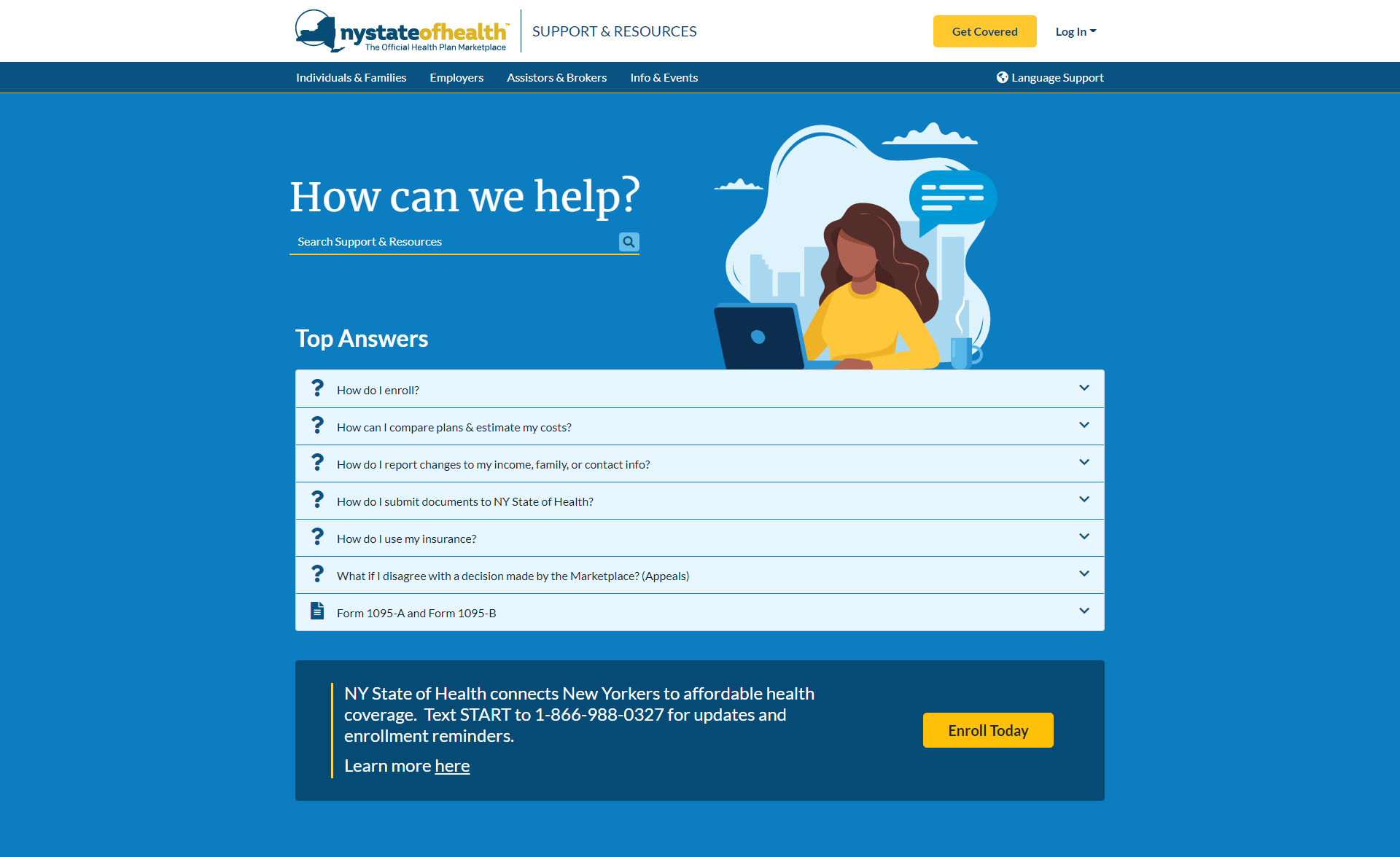
Competitive analysis lead us to some conclusions about how we might mold an identity for this sub-domain, and we proposed a re-naming of Support & Resources to fit the form and purpose of the site. Obviously, it would still need to live within the ecosystem of the larger brand so we had to proceed thoughtfully. We decided to start moving the color and design system toward modernization, and lay the groundwork for future redesigns involving other properties. A large focus was placed on creating friendly, approachable design language.
Scalable navigation patterns
A large portion of the contextual cues needed to improve the user’s mental model of the site were to be solved through a new navigation menu. A great deal of focus was put on both improving this area as well as going back and enhancing the primary website’s navigation to better the new model. Content was segregated by audience, with clear categorization, and sorting in order of importance.
Improve organic discovery
We had formed a good idea of what was important to solving the problems of the users, but we couldn’t rely entirely on navigation to get them there. With the knowledge that search performance was being optimized in the near future, we placed search at the top of the page with a bold call to action encouraging its use. The most popular search terms/topics were given prominence on the page with the ability to expand a content summary without needing to leave the page.
Finalization and Handoff
Multiple rounds of presentation, feedback and iteration later we finalized a high-fidelity prototype and created a full compliment of design specs and accompanying style guide for the client’s developers.
